Cedar Lane Studio | art & design
  • Home
  • Mary Moore
    • watercolour
    • Plein Air
    • Fun Floral
    • Pastels
    • Jazz and Open Stage themed
    • Archive
    • Children's Books
    • Mary's Bio
  • Tom Lillico
    • Tom's prints for sale
    • Archive
    • Tom's Bio
  • Design
  • Blog
  • Contact Us

Encourage & Explore

Mirror reflections, Saturday morning

5/30/2015

Comments

 
Working with a limited palette Saturday morning, fun to explore. From top left: Brenna, Will, Maddy and Hannah.
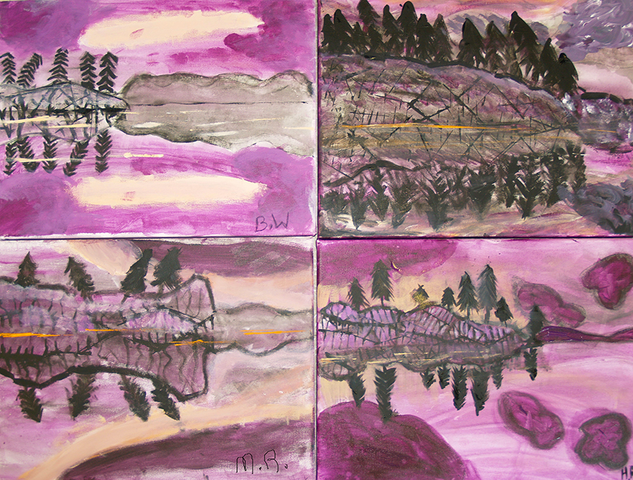
Picture
Picture
William Deschamps
Comments

Monoprints - combining art and play...

5/28/2015

Comments

 
Picture
Mary Moore, poppy
Picture
Linda Chapeskie, Lily
Picture
Alison Cotter, Trees Against the Sky
The top two monoprints above are the result of a single pressing, while the bottom one has some overpainting (the trees) added afterwards.
This week at Cedar Lane Studio the Wednesday evening group enjoyed a relaxing and playful session creating watercolour-based monoprints. A monoprint is a one-off print, since generally the process only allows for one 'take'. Our method used frosted acetate, watercolours and dish detergent. A simple process, you coat the surface of the frosted acetate thinly with detergent - this helps to release the paint when printing. Once that is dry you create a simple watercolour painting, keeping shapes simple and colours vibrant. Pre-soaked pieces (we worked at about 5"x7" sizes) of 140 lb watercolour paper were removed from the tub, and some excess water was patted off between sheets of newsprint. The painted acetate is carefully placed over the paper, then a breyer is used to provide the pressure to make the transfer happen. Peel them apart and voila!

What makes monoprints an exciting is the surprise results of seeing all applied colour come together on the print at once. The first colours applied are the ones at the forefront, and the blends and results are contingent on the wetness of the paper, in particular. Because they are small, you feel no performance pressure. They are just a lot of fun!
Picture
A selection of our favourites. There were lost more! Click to see a larger image.
Comments

Goddess realised...

5/22/2015

Comments

 
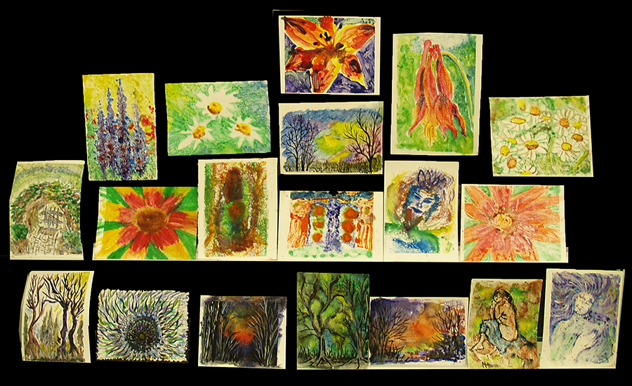
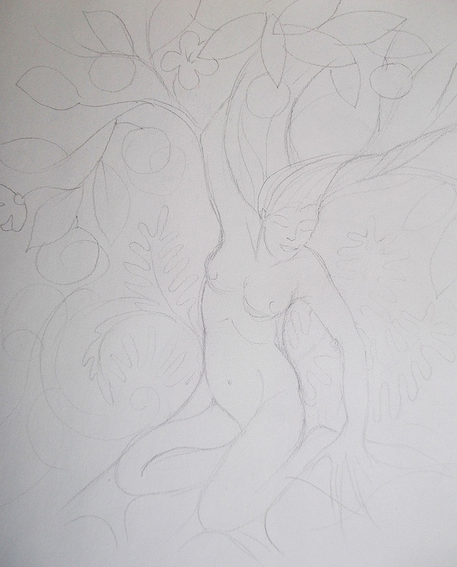
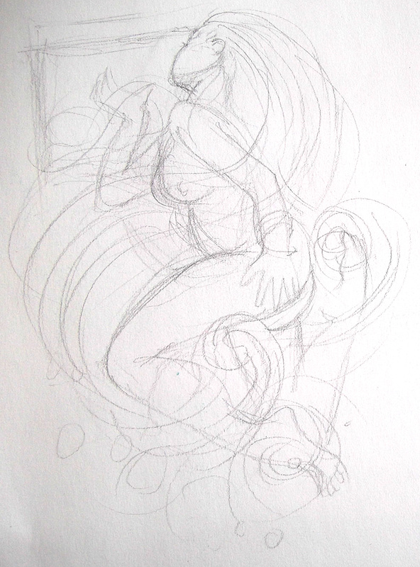
Wednesday afternoon this week I took the time to whip up a couple of goddesses. Now, I have to call much of what we do here 'studies', which means, don't sweat it! We explore in a couple of hours, and whatever happens happens. The process is the important thing, and the result is, well, it is what it is in a couple of hours. Often students will work on pieces further at home, and so do I. Below are my idea development examples.
Picture
Tree goddess
Picture
Water goddess
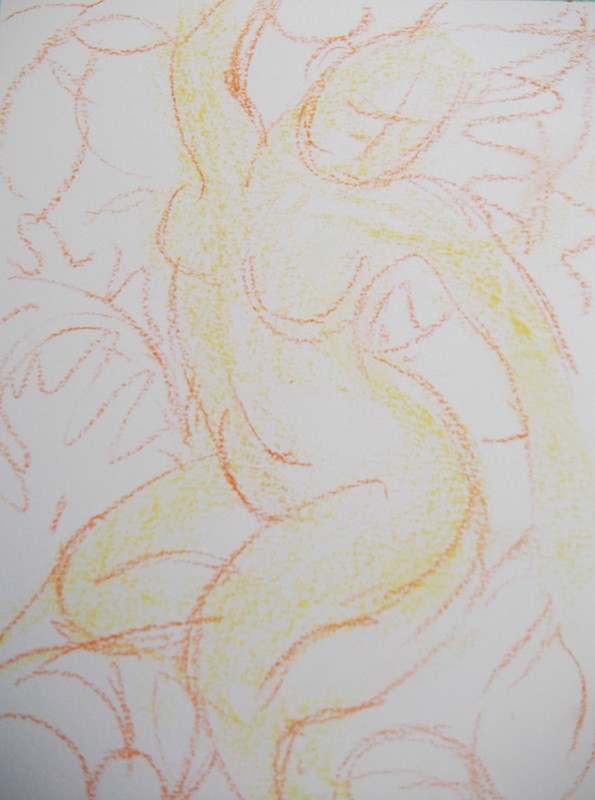
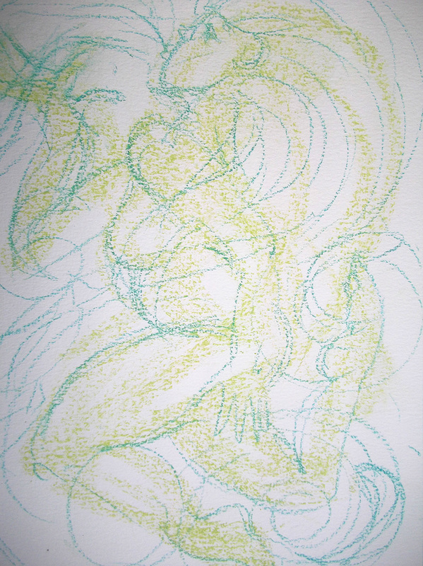
The drawings are fairly refined, and I wanted the paintings to be looser, so in the next step, on the actual water colour (140 lb) paper, I used yellow pastel to block in the shapes, then orange pastel to solidify the drawing. These paintings were going to be splashy ones, so I didn't want the under-drawing to be too tight. Also, I decided I wanted the tree goddess to fill the picture frame more.
Picture
Picture
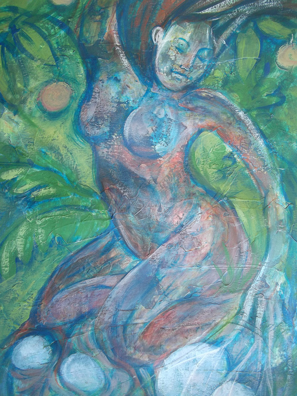
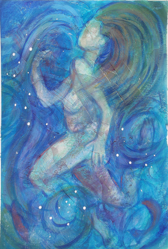
I sealed the pastel with hairspray, then scudded gloss gel medium across the surface of each painting, being sure to leave some surface untouched. The different surfaces would absorb or resist paint applications differently. One thing I realized as I splashed watered down fluid acrylics on each was that the cool colours used in the water painting fairly disappeared, so bad choice there as I really had to search for my drawing after words. Anyway, the results after splashing, scumbling, reinforcing the drawings repeatedly, are below. Certainly worth further exploration. Maybe a series?
Picture
Picture
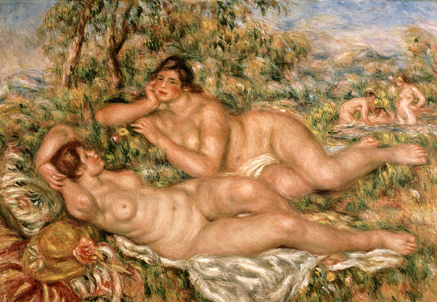
My students, all goddesses themselves, using the same process released these lovely goddesses of their own.
Picture
Comments

The goddess within...Wednesday, May 20

5/19/2015

Comments

 
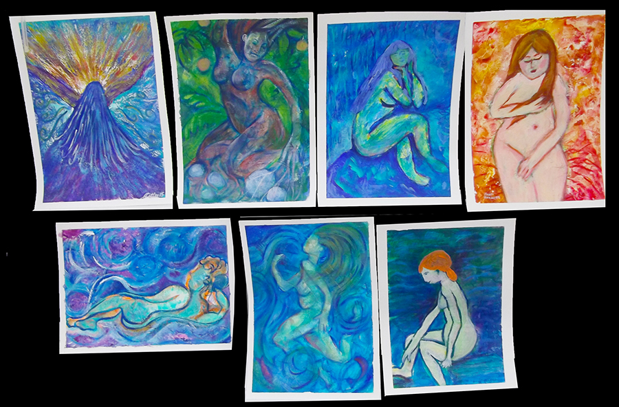
Must be because I just got home from a Brockville Women's Business luncheon...about 60 sharp gals who run their own businesses. When I got home I started thinking about a focus for tomorrow. Sometimes I go on Pinterest to see what twigs me, and there I found Renoir's bathing women:
Picture
Picture
Picture
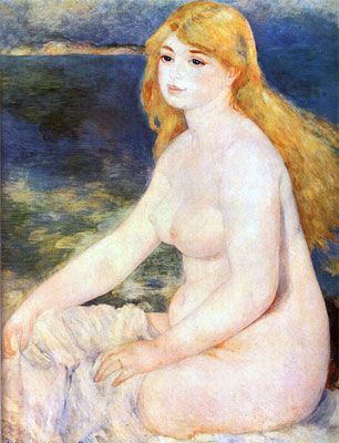
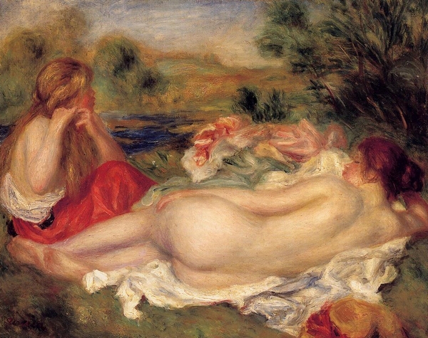
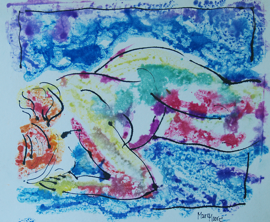
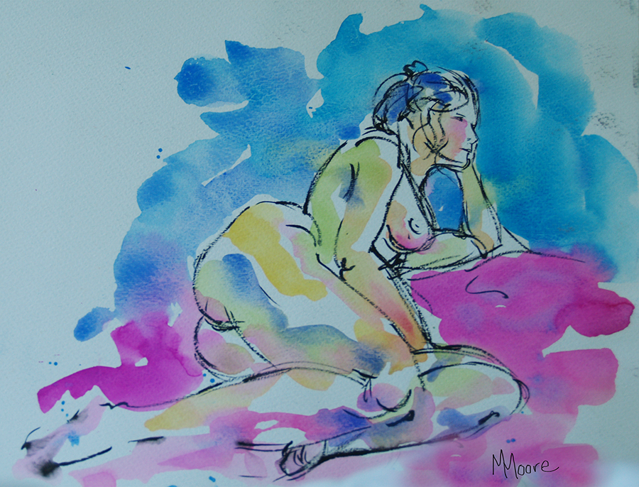
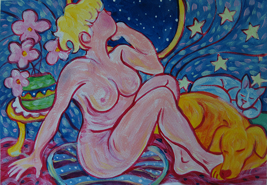
Now, these were gals who didn't mind a little flesh roll here and there! And obviously didn't have to worry about the UV index!

So, maybe the idea of painting nude women bathing is a little passé (and given the mosquito population around here, I totally get it), but celebrating the goddess within never goes out of fashion - and the bathing goddess - always good!

I have studied, painted and drawn the nude (male and female) since I was a teenager - a right of passage as a serious artist.  Then, a few years ago, I purchased a wonderful book called Paint Happy, by Cristina Acosta. Her playful, fearless approach to creating a painting has informed my process since then. So below, two of my nudes (watercolour and ink) done from life, and my goddess painting, after Cristina.
Picture
Picture
Picture
And for those students for whom the bathing female nude goddess is not a happening thing, how about the bathing nude animal? Like this charming otter (or your dog? a hippo? a cat? well, maybe not a cat....
Picture
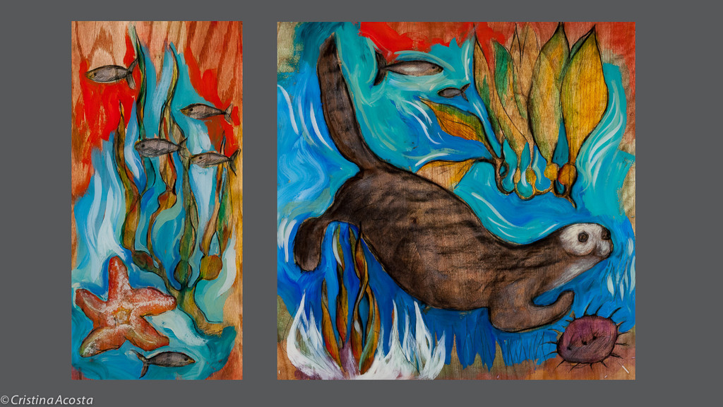
Otter diptych, Cristina Acosta
Hope you can make it!
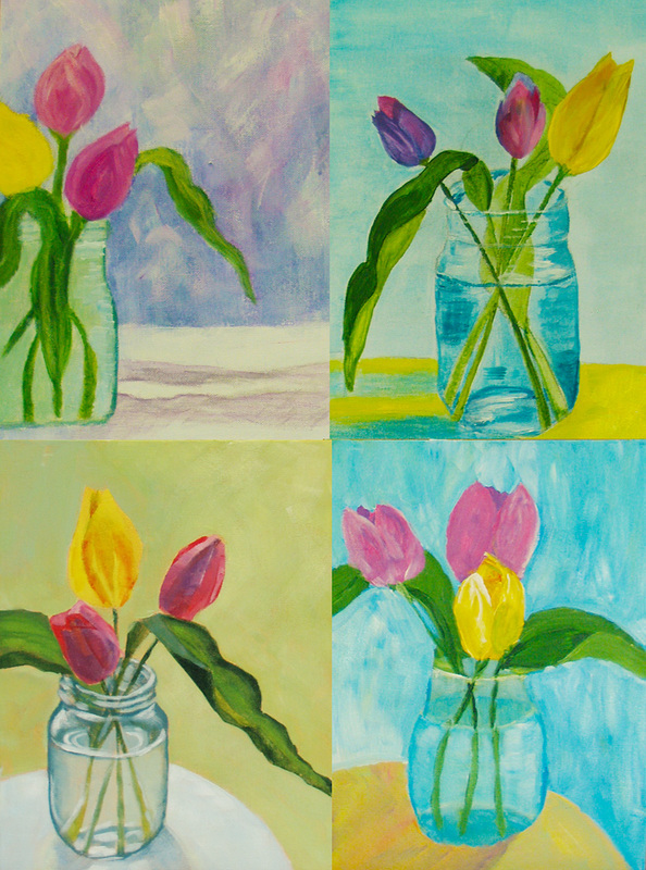
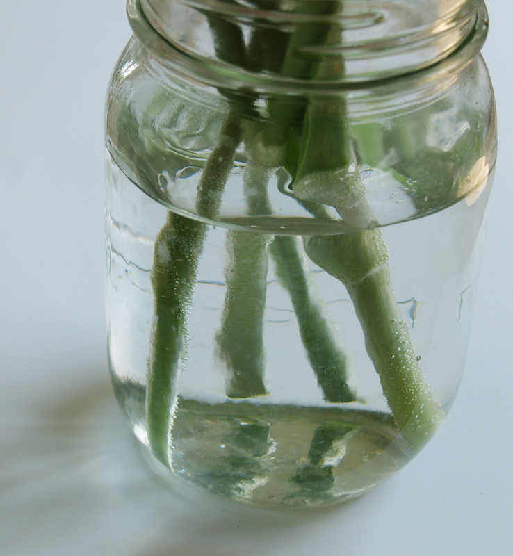
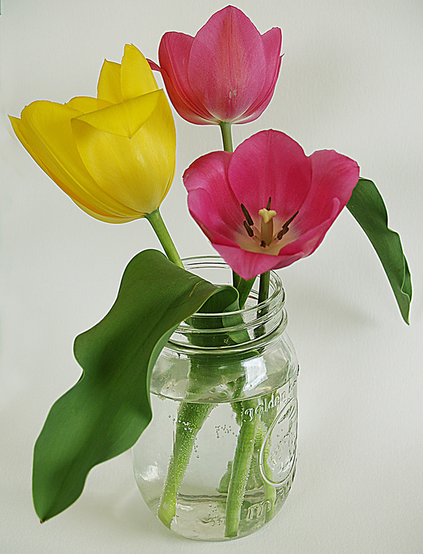
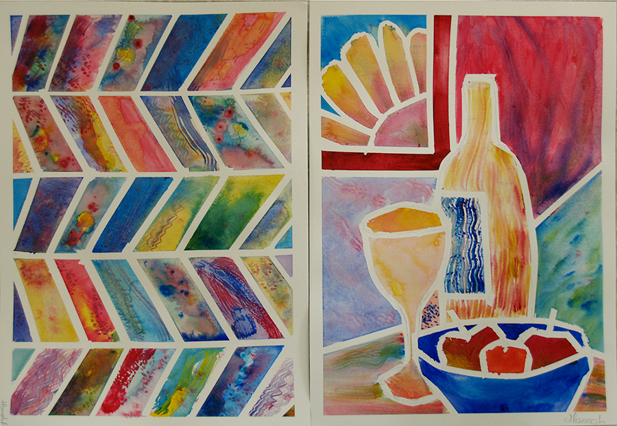
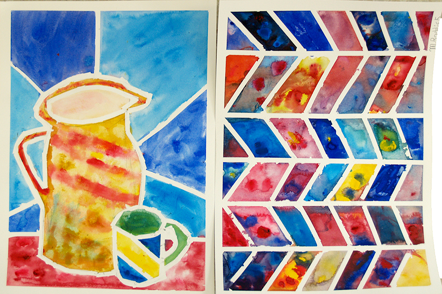
Cheers, Mary
Comments

More tulips...

5/19/2015

Comments

 
About once a week, Tuesday before my Wednesday class, I set out to let folks know what is coming up Wednesday, and what went on the week before. So, this is my 'week before' post:)

Monday and Wednesday of last week we all painted tulips in a jar. I was able to post the Monday groups beautiful work last week, but here is the Wednesday group's lovely offering. One of the concepts I wanted to get across was economy of brush work. This is true in any medium, but acrylics present their own challenges. Chiefly, unlike oils where each brush stroke is 'informed' by that underneath, picking up the wet undercolour, in acrylics every brush stroke tends to stand alone. While 'intention' is important in any medium, in acrylic your intention (creating direction, colour, shape, contour etc) is clearly evident with every brush stroke. So, intention has to be a large part of your decision process.

I often scumble while loosely building a painting, eventually my brush work must have intention. Happily, in acrylic, if you screw up a brush stroke, you just add more until you get what you want. Yay!

Wow, you guys, awesome work!
Picture
Comments

The simplicity of tulips in a jar

5/12/2015

Comments

 
Funny how the mind can travel (well, my mind at least, and I know of a few of my sibs whose minds travel the same kind of meandering path!). Someone posted a neat video showing a very highly realistic drawing of a glass of water, and that got me thinking of how enjoyable it is to take a relatively simple object and draw it. I have a wonderful young student, very smart and very visually gifted, who comes for drawing lessons. We decided we would both draw the glass of water. I don't have a photo of his, which was pretty good! But here is mine. 6B pencil plus white Prismacolor on grey paper (the darker area in the foreground is my shadow while taking the pic).

Then I started thinking of the lovely, homey simplicity of flowers in a glass jar, so yesterday my Monday students enjoyed a simple set up from life. The challenge offered was two-fold: aim to make the water in the jar believable, and keep it all simple. Our efforts below - pretty cheery!
Picture
Picture
Picture
Depending on the angle you are viewing from, expect to get some refraction of image within the water, so the stems may not quite line up. Also, the stems in the water are lighter in value. Notice the meniscus effect at the water's surface. Lots of things to see! Plus, the tulips opened up more and more as we painted!
Picture
Comments

Happy trees and more...

5/12/2015

Comments

 
Picture
Last Wednesday evening our thoughts were on spring blossoms, honouring trees, and noticing how they spring from the earth and reach for the sky. The light is still good at 7:00 when students arrive, so we risked mosquitos (it wasn't too bad) and took a little walk in the woods for inspiration. And inspired we were!
On Saturday I took the time also to paint another night scene. I will really have to explore this more fully sometime from my own images. This study (acrylic on water colour paper) used a resource pic from the internet (a Paris street in the rain).

I started off with a simple line drawing, then used a credit card to block in colour, starting from the lightest value. The darks provide the structure and definition.

Below is the quick 15 minute study/demo I created of a park bench. I can smell the rain on the grass!
Picture
Picture
Comments

Spring Trees

5/5/2015

Comments

 
Picture
Picture
Here are a couple more paintings from Pinterest for inspiration
Picture
Picture
Picture
Spring Tree after the above, by Sandra Ketchum
Here at Cedar Lane Studio I have done any number of tree-themed paintings with students. The soft emerging tones of the forest are so inspiring, gentle and soothing.

Both projects at left used glazing. The top left image also uses spackle for the bottom texture. In the bottom right painting we used drips to create tree trunks, then glazed in the background.

Below I used a palette knife to create the soft greens so prevalent in the spring woods (a little slice of our woods below the painting.
Picture
Picture
SO, spring trees will be our inspiration this week at Cedar Lane Studio. I look forward to seeing some super work - we always surprise ourselves!
Comments

Inspired by colour, shape and the world around us!

5/3/2015

Comments

 
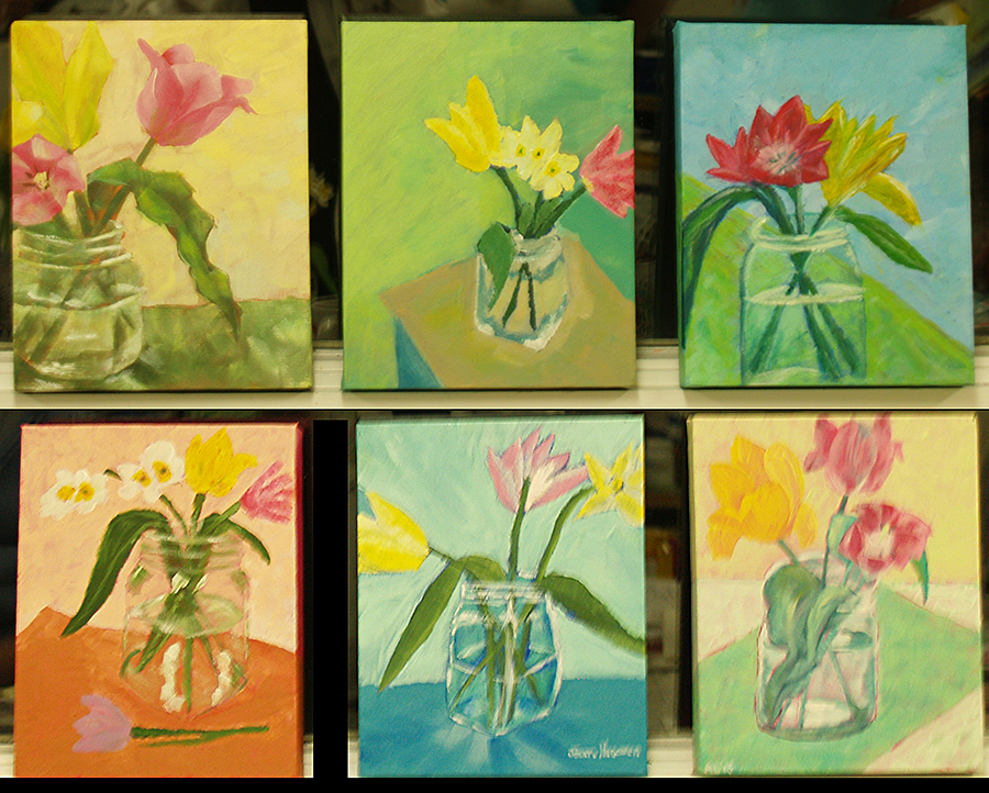
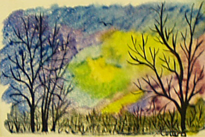
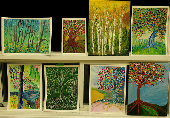
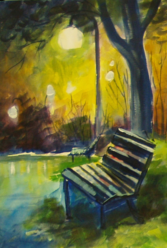
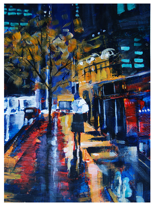
This will be a quick post about the last couple of weeks in the studio. I generally let me mind wander a bit when I am looking for inspiration - and I never have to wander far! I love trying new ideas, refining past processes. All our efforts and approaches demonstrate that there is no single process, technique or approach that will guarantee satisfaction. In addition, understanding the relationships between form and colour, value and composition are reinforced with every new project, no matter the approach. So, in the past 2 weeks adults and kids alike have met the challenges and the results are happy-making!
Picture
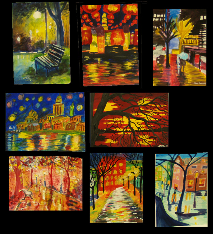
Night Skies - Wednesday Adult group, acrylic on paper
Picture
Geometric, Hannah Porter (12 yrs)
Picture
Geometric, Maddie Roddick (12 yrs)
Picture
Saturday, my three young students and I went out to the woods and sketched in pencil and oil pastel, then came back in to the studio and used odourless turps to blend the pastel I could kick myself for not getting images from their work, but things get pretty busy... Here is my 'study', but I assure you theirs was better! Maddie's looked like an Emily Carr.

Below are the Monday group's oil pastel flowers, inspired by Georgia O'Keefe (an oft recurring theme here - so much fun t do!). These used the same process.
Picture
Comments

    Author

    Welcome to my blog, about my classes and activities at Cedar Lane Studio. Feel free to comment (but don't be mean :(

    Archives

    March 2017
    February 2017
    January 2017
    October 2016
    June 2016
    May 2016
    March 2016
    February 2016
    January 2016
    November 2015
    October 2015
    September 2015
    July 2015
    June 2015
    May 2015
    April 2015
    March 2015
    February 2015
    January 2015
    December 2014
    November 2014
    October 2014

    Categories

    All
    Art Classes

    RSS Feed

Picture
Contact Mary:
613-294-0373 • mary.moore@cedarlanestudio.net

Contact Tom:
613-658-2916 • tomlillico@ripnet.com

Interested in Lessons in your school?

ArtReach
Check out my ArtReach Program: curriculum-linked lessons delivered to your classroom! All supplies included.

  • Home
  • Mary Moore
    • watercolour
    • Plein Air
    • Fun Floral
    • Pastels
    • Jazz and Open Stage themed
    • Archive
    • Children's Books
    • Mary's Bio
  • Tom Lillico
    • Tom's prints for sale
    • Archive
    • Tom's Bio
  • Design
  • Blog
  • Contact Us