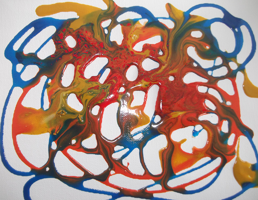
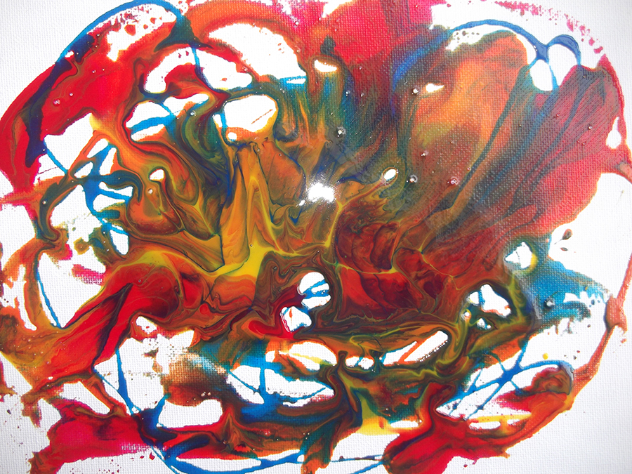
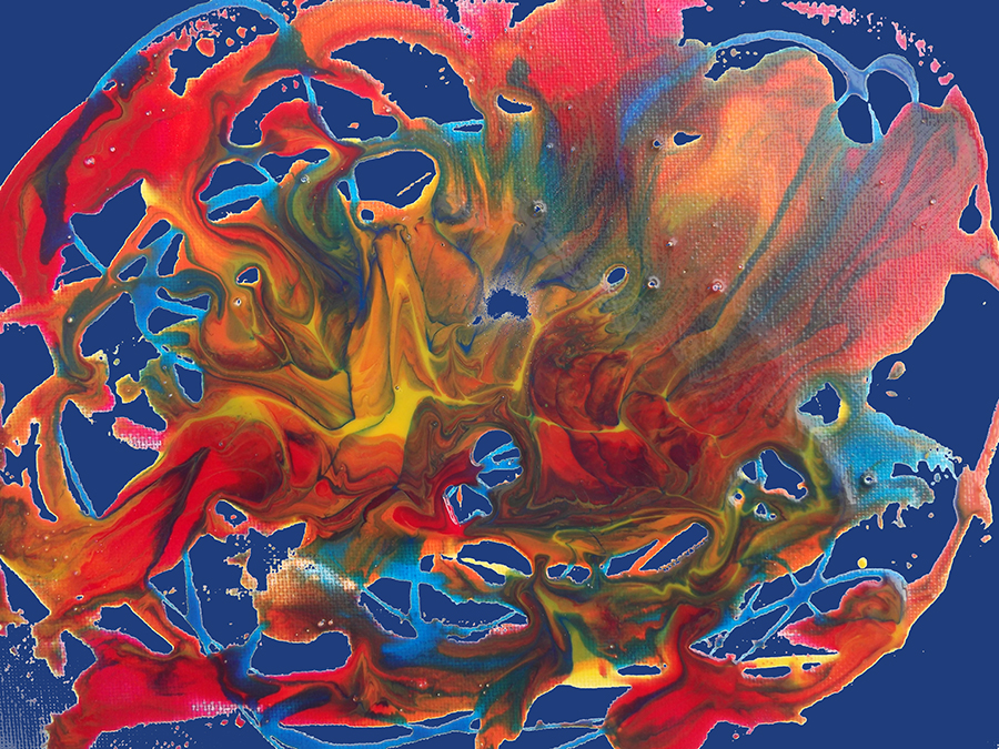
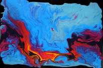
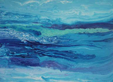
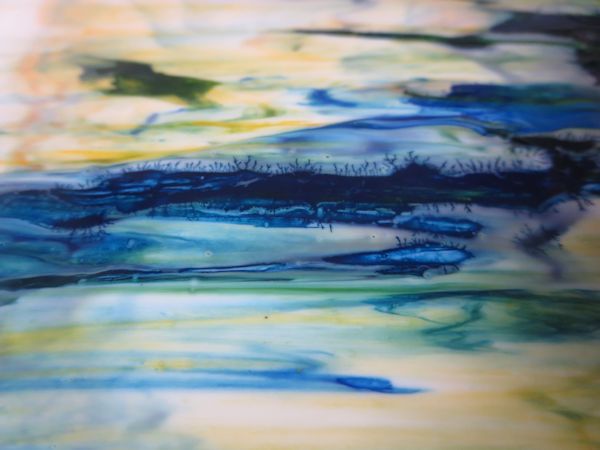
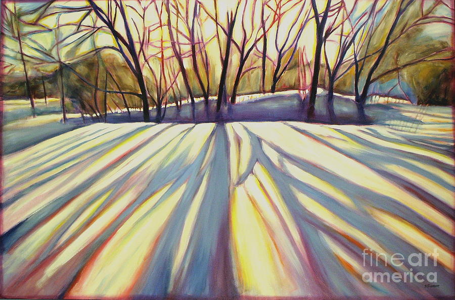
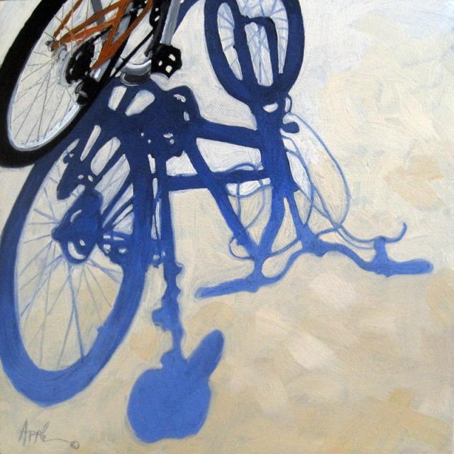
Pouring paint directly onto a canvas, and then tilting the canvas to move the paint around, is a technique that blends the colors together beautifully. Even when dry the the paint appears to flow and mix itself over the canvas. This week we are giving this a try. It is not my usual process, so I am having to dig deep to find the process that will work for me, and for my students. Your creative choices are your palette of colours that you choose (I have pre-mixed several, ready to go), and then, how you tilt, move, pour and even coax a little with palette knives or brushes. In my first paintings, I did not want to cover the whole surface - partly because I didn't want to use up too much paint before my students got at it:) I am thinking of making some of the white spaces in the first sample little creatures. In the second I may simply paint the white areas a dark blue colour. I simulated that in Photoshop in the third image. Other creative potential: see what you see in your piece and enhance that image, or simply overpaint an image that resonates for you onto the painting. Below are some lovely paintings from various artists.
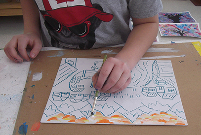
As I mentioned, the Wednesday night group conquered their winter chills with a blast of colour again this week, in our 'Shadows in the Snow' series. We explored mixing tints at the same time, and studied the nature of light in shadows. Once the drawing was laid out in conté, students were encouraged to abandon the photo and paint with their hearts. Oh yeah! 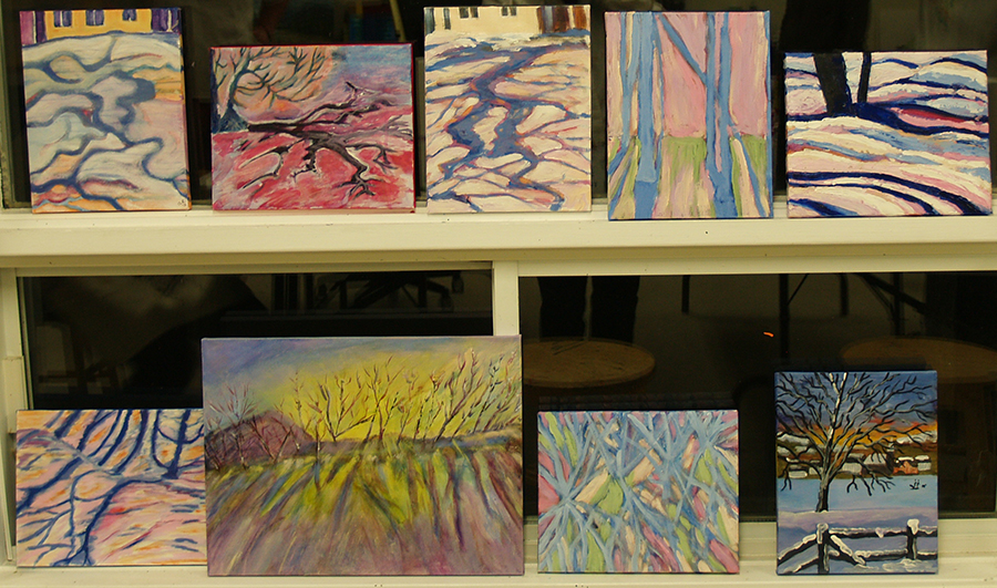 Actually, the last 2 weeks were pretty colourful ones at Cedar Lane Studio. I was feeling dragged down a bit by the extreme cold, and maybe by the fact that I am not going anywhere for a winter holiday :( So, 2 weeks ago both the adults and the kids looked at the colourful winter landscape paintings by Quebec and Vermont artists. We had a lot of fun 'building' our villages, choosing our bright palette of colour and executing the painting. Here are a few of the scenes by the adult class. 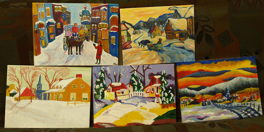
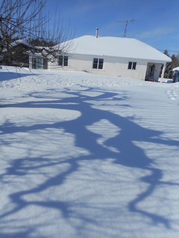
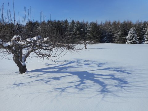
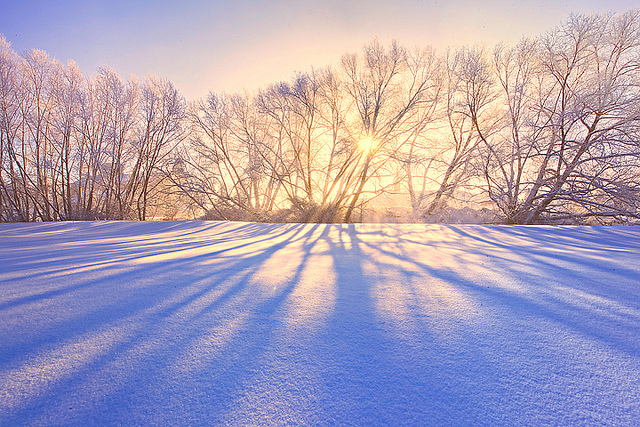
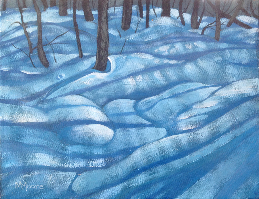 Shadows in the deep snow, 9x12, acrylic Shadows in the deep snow, 9x12, acrylic While shadows are a delight to perceive, they can be troublesome to paint, in particular from the aspect of color. Beginners tend to paint shadows using black pigment. The Impressionist Renoir is quoted as saying "“No shadow is black. It always has a color. Nature knows only colors and… white and black are not colors".” So if black was to be banished from their palettes, what did the Impressionists use for shadows? How the Impressionists changed the colors we use to paint shadows. Working from the then-relatively new theory of complementary colors, the logical color to use was violet, being the complementary of yellow, the color of sunlight. Monet said: “Color owes its brightness to force of contrast rather than to its inherent qualities …primary colors look brightest when they are brought into contrast with their complementaries.” The Impressionists created violet by glazing cobalt blue or ultramarine with red, or by using new cobalt and manganese violet pigments that had become available to artists. This week's lesson will look at tree shadows on snow, with students using creative color to paint their chosen scene.
|
AuthorWelcome to my blog, about my classes and activities at Cedar Lane Studio. Feel free to comment (but don't be mean :( Archives
March 2017
Categories |
 RSS Feed
|
|